Welcome back! We're thrilled to continue our journey with Sympathy for Data. In our previous guide, we imported a CSV file with car data. Now, let's dive into how we can use the data viewer to explore this data further.
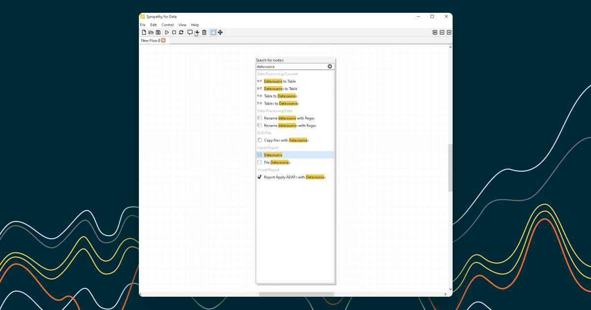
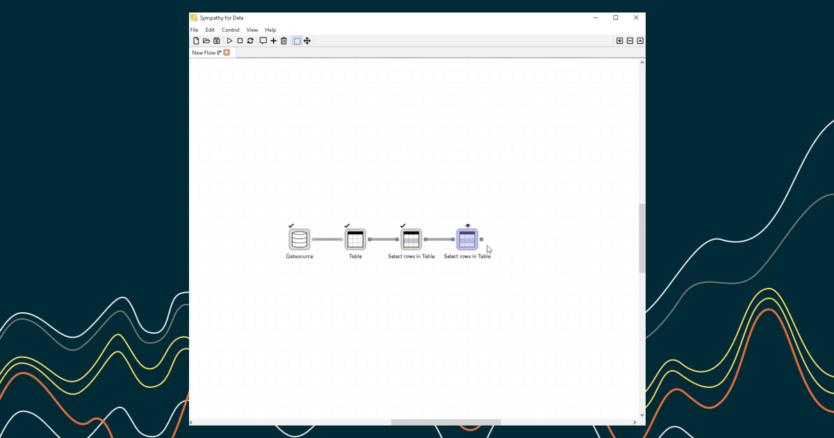
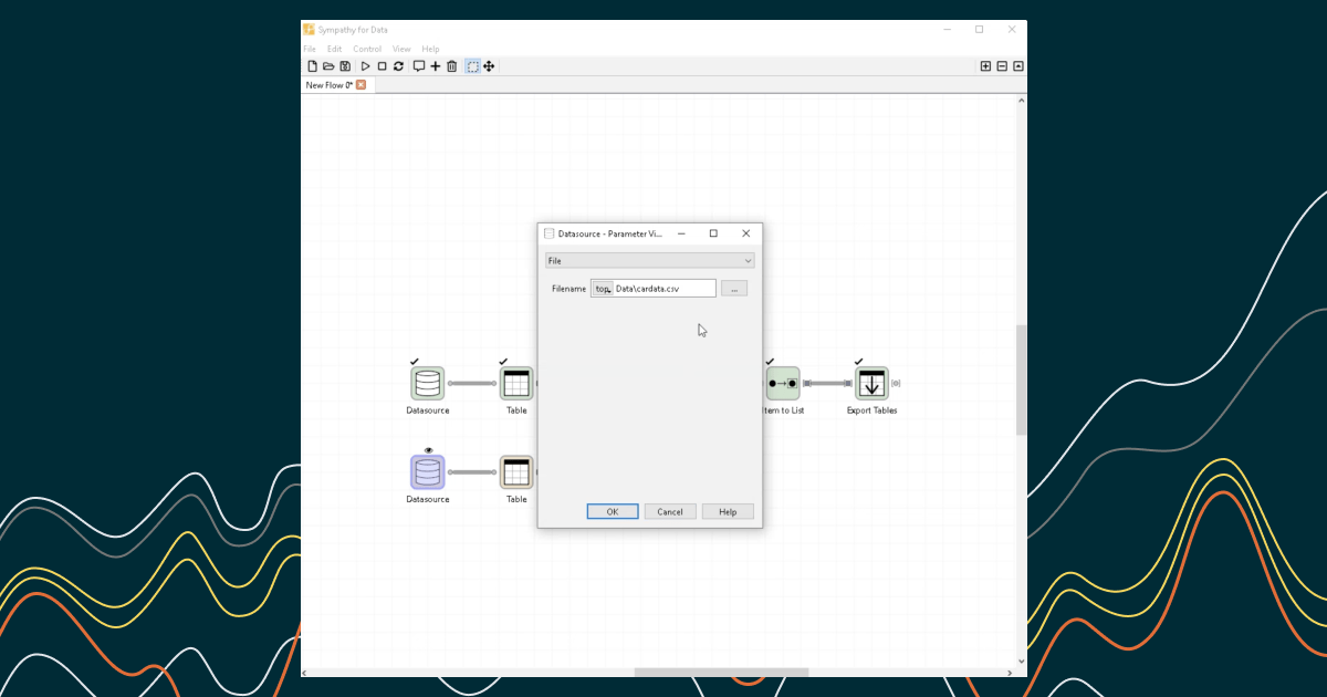
Step 1: Opening the Data Viewer
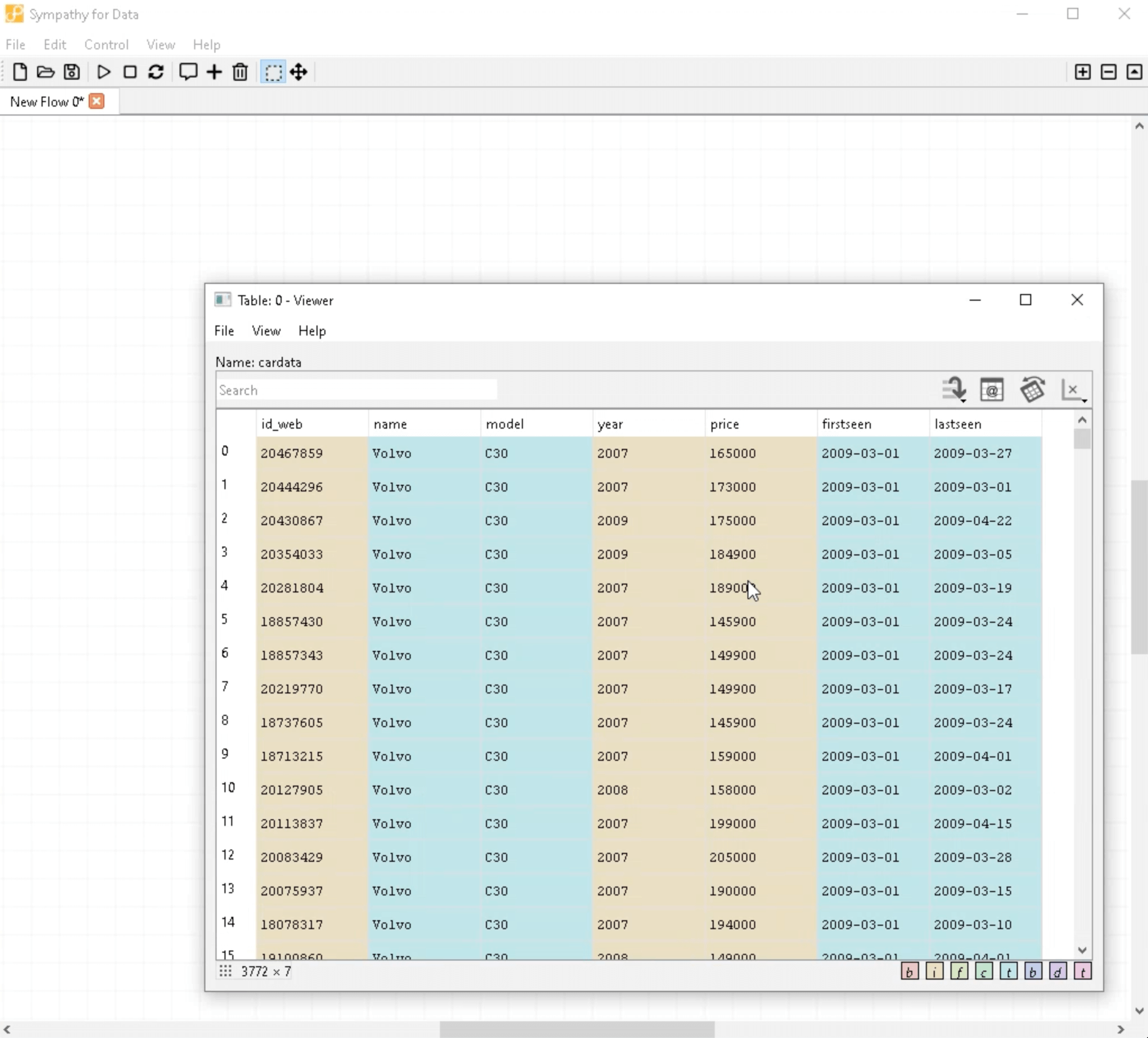
Let's start by double-clicking on the output port. This action brings up the data viewer. Here, we see car prices from different years which we can explore by navigating through the table.
Step 2: Plotting the Data

To get a better overview, we're going to plot the data. Right-click on the "year" column and select "Plot column as x". Then, scroll to the "price" column and select "Plot column as y".
Step 3: Understanding the Plot
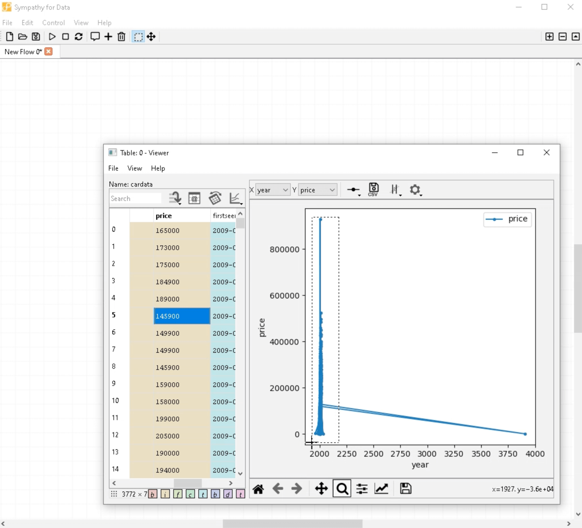
This generates a line plot with "year" on the x-axis and "price" on the y-axis. Data points are marked by circles. However, watch out for outliers like a data point around the year 4000. Such outliers are likely errors and skew our visualization.
Step 4: Zooming In
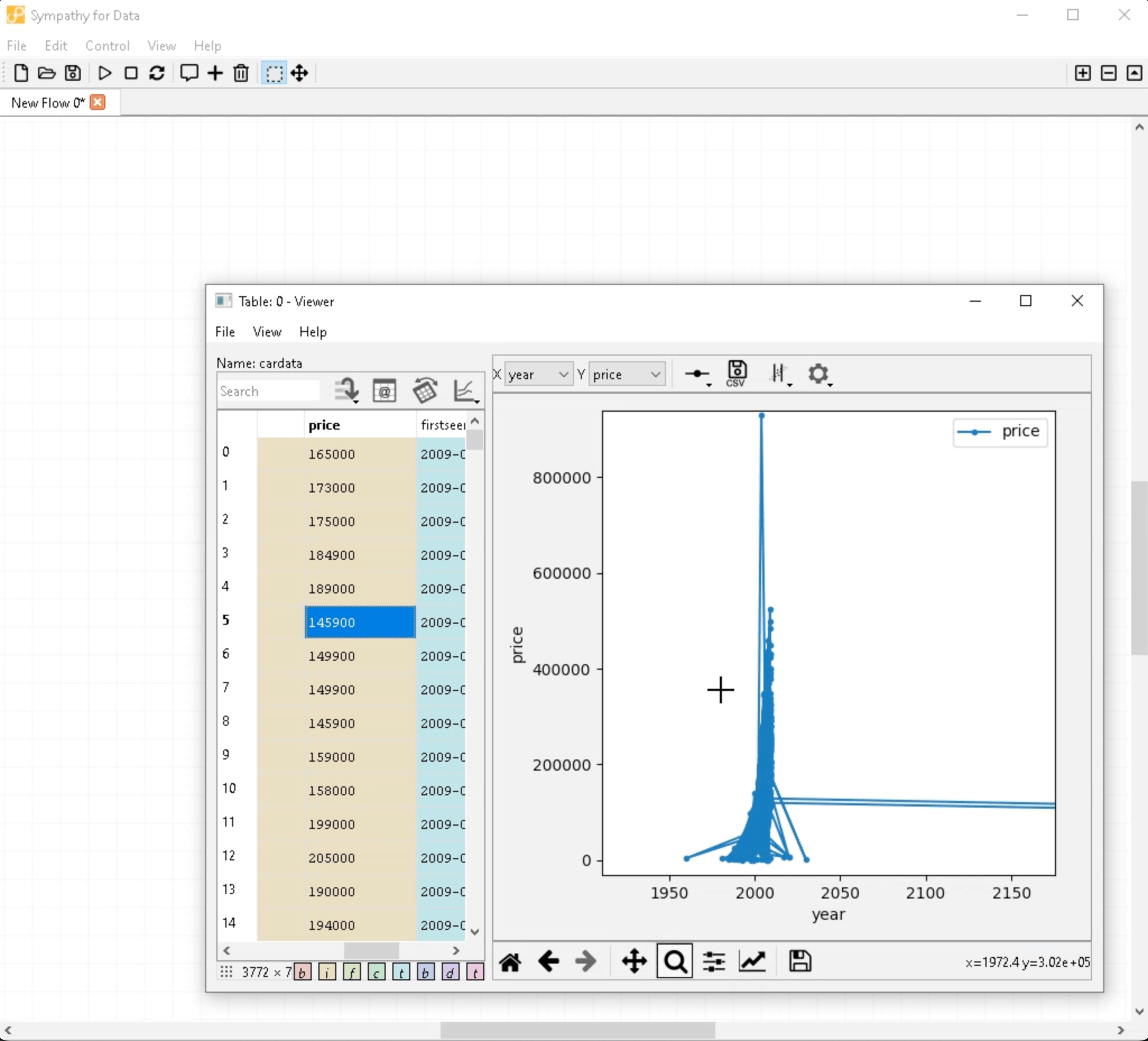
To focus on the region with most data points, use the magnifying glass button to zoom in. Upon zooming, we notice that most data points are located between 1980 and 2010. Going even further reveals that the bulk of data is concentrated between 1985 and 2010. Prices range from very low to up to 500,000, and we observe an upward trend. Talk about inflation!
Step 5: Plotting a Histogram
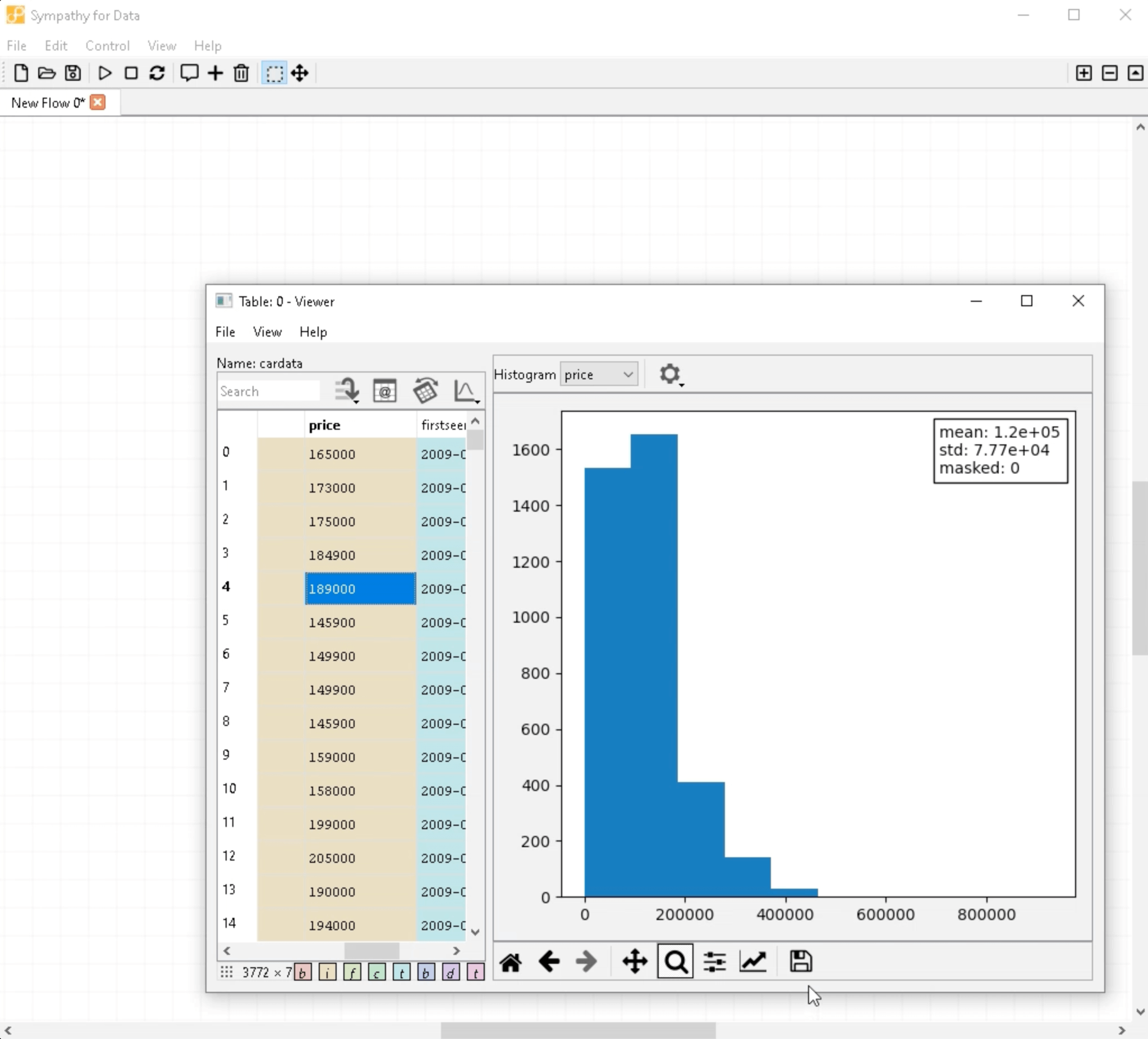
For a different perspective on the data, we can plot it as a histogram. To do this, simply select "Histogram plot" from the plot button and choose "Show histogram for column" on the "price" column.
Step 6: Understanding the Histogram
The x-axis on the histogram shows the price and the y-axis the number of data points. From this plot, we can observe that most data points fall under prices below 200,000. Prices between 300,000 and 500,000 exist but are much rarer.
Step 7: Adjusting the Viewer
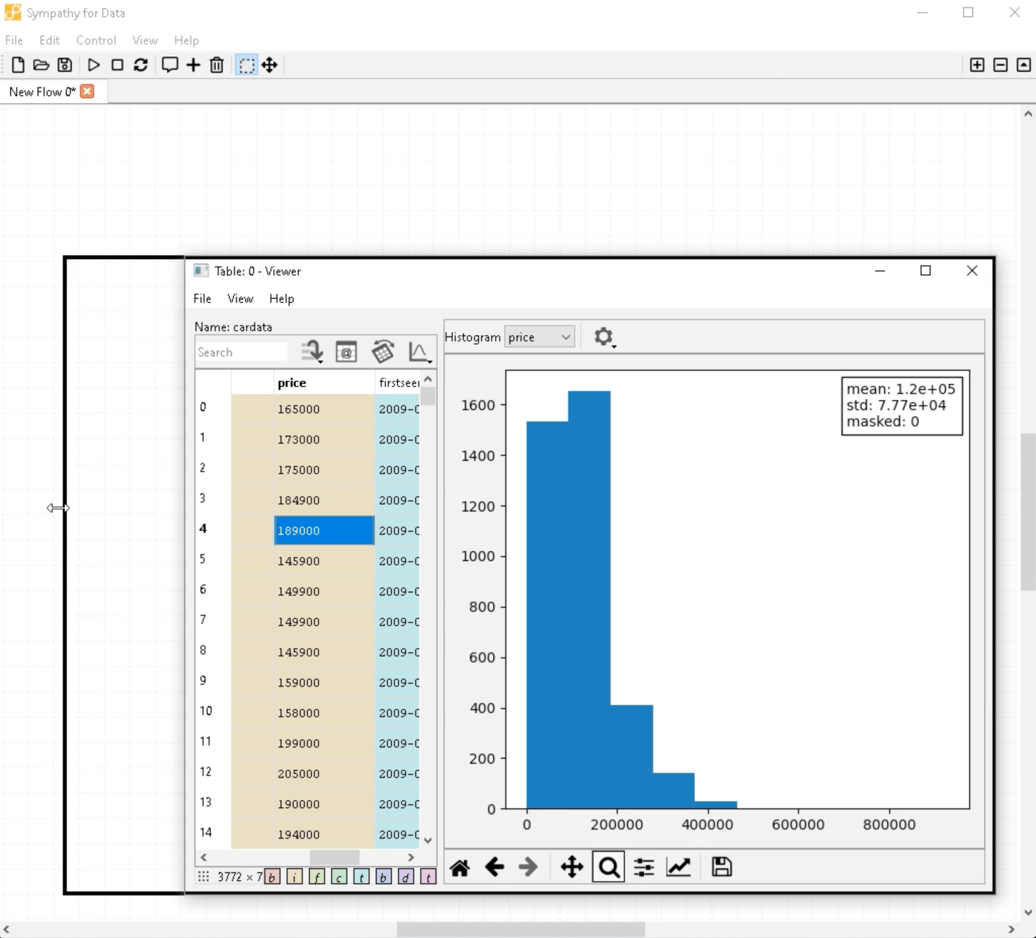
The data viewer was initially shrunk to accommodate the plot. Let's maximize the data viewer to get more viewing space. We can also adjust the division between the data table and plot for a clearer view. Once you're done exploring, simply close the viewer.
Congratulations! You've learned how to use the data viewer to explore data in Sympathy for Data. Thank you for following this guide. We hope it was helpful and engaging. If you have any questions, feel free to reach out. Happy data exploration!
Thank you for watching!